Just Playing Along …
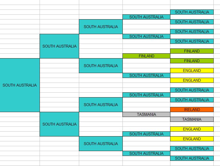
When I got home from work today and logged on to Facebook, I noticed that my feed was full of 5 generation colour charts. Wondering what all this was, I discovered that my geniemate J. Paul Hawthorne started the trend by posting a picture of his chart saying …
“A little visual I created in Excel. 5 Generation chart of my direct ancestors birth state — starting with me. A good way to visualize migration patterns.”
Obviously this piqued everyone’s interest, as they decided to play along too – as did I.
Creating a chart in Excel that covers 5 generations (starting with yourself), and then putting the birthplace (state or country) in each box for your ancestors, colouring each place a different colour. It does make for interesting viewing.
Here’s mine …
Go ahead, do yours. You’ll find it really interesting!


Leave a Reply